2022-02-15
While modeling disclosure timing for Political Information Flow and Management Guidance, I felt like the rough and ready reduced-form regression approach that serves the accounting literature so well was adding a level of unhelpful abstraction.
So rather than just model time_to_event or before_event as a function of some D_of_interest and $CNTRLS:
regress time_to_event treatment $CNTRLS, cluster(id)
// or
regress before_event treatment $CNTRLS, cluster(id)
Instead I was looking for a clean expression of the disclosure timing patters of two groups around a set of events. I really wanted something that a reader could look at and immediately grasp the patterns and their differences–always the goal with the main finding of a paper. Then we could go on to perform more conventional analysis for robustness.
I looked for something that would let me show the reader both the magnitude of the differences between the distribution of disclosure around the political events, and, because disclosure timing is noisy–especially due to weekends–the uncertainty associated with the magnitudes. Now, visualization is a deep rabbit hole worth diving into, but I wanted something that was only a step or so removed from a histogram. I settled on a plotting kernel density estimation, not because it’s the only way to do such a thing, but because it is relatively straightforward to implement and explain.
Here’s a quick example in Stata:
First install these:
ssc install moremata
ssc install kdens
Then generate some data:
clear
set obs 10000
generate group = (_n <= 5000)

/* post event pattern for group 1 */
generate days_to_event = rbeta(2,6)*15 if inrange(_n,0,2500)==1
/* preevent patter for group 1 */
replace days_to_event = runiform(-30,0) if inrange(_n,2501,5000)==1


/* post event pattern for group 2  */
replace days_to_event = runiform(0,30) if inrange(_n,5001,7500)==1
/* pre event patter for group 2 */
replace days_to_event = rbeta(2,2)*-15 if inrange(_n,7501,10000)==1

/* hist shows the basic patterns */
histogram days_to_event, by(group)
Next use kdens to estimate functions for each group setting aside a density d, and an upper and lower confidence interval bound (ci) for each day to the event x:
#delimit ;
kdens days_to_event if group==1,
    gen(d1 x1)
    ci(ci1_1 ci1_2)
    ;
kdens days_to_event if group==0,
    gen(d0 x0)
    ci(ci0_1 ci0_2)
    ;
#delimit cr
You’ll notice that this actually creates a plot (see help kdens for the option to suppress this). We want to combine them via twoway as follows:
#delimit ;
twoway
rarea ci0_1 ci0_2 x0 , color(orange%20) || // ci for group 0
line d0 x0, lc(orange) || // line for group 0
rarea ci1_1 ci1_2 x1 , color(blue%20) || // ci for group 1
line d1 x1, lc(blue)  // line for group 1
legend(
    order(1 "group 0" 3 "group 1") // # ref to order above
    pos(11) ring(0) col(1) // location of legend
    )
;
#delimit cr

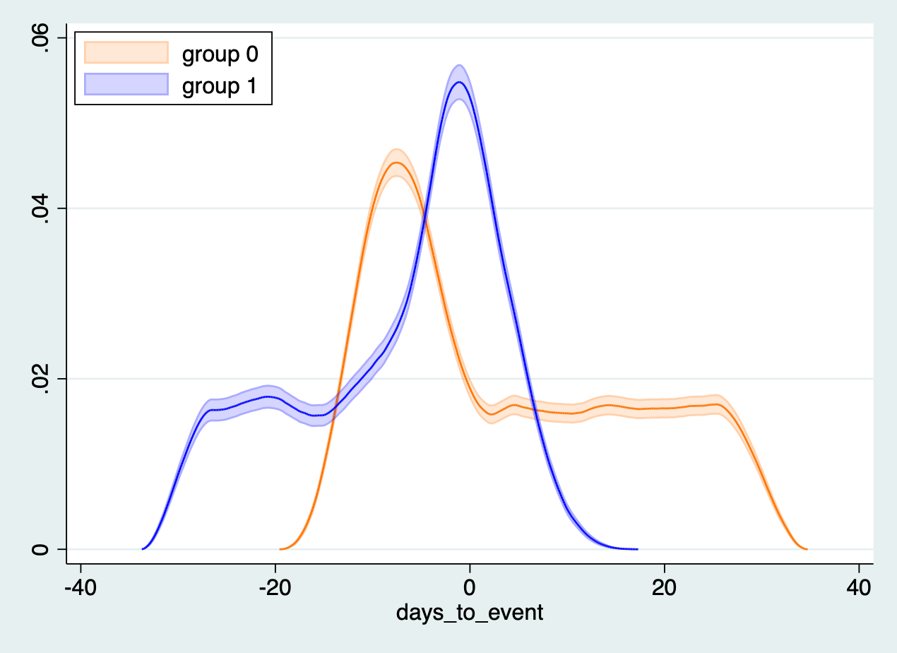
This yields a plot allowing us to compare the distribution across the two groups! Interpretation is simple, when the orange isn’t touching the blue group zero and group one are different, and the difference–for those who care about such things–is statistically significant.
Helpfully, kdens uses the standard notation for weights so you can easily incorporate weights from something like ebalance into the model and control for covariates in a way you couldn’t in a simple histogram.
